If you’ve spent any time on Instagram over the last few years, you’ve almost certainly noticed the proliferation of collage pictures — even though Instagram’s default image size is rather small, users often take several photos and mash them together using third-party apps before posting them. Instagram has noticed this trend — the company says that one in five of the app’s 300 million monthly active users post collages — and it led the company to build Layout, its second standalone app, which launches today for iOS. (An Android version is due in the next few months.)
Like Hyperlapse before it, Layout is focused on making one thing as simple as possible — in this case, building photo collages that are easily exported to Instagram. As project manager John Barnett and designer Josh Dickens told me, Instagram had looked at the other photo collage apps and felt like they could make one much simpler and easier to use. As they were building Layout, Barnett and Dickens noticed that most third-party apps present the users with a big grid of potential layout designs, which forced users to figure out exactly how many pictures they wanted to include and how they wanted to arrange them as a first step.

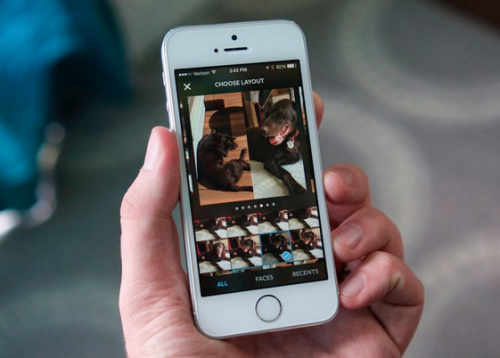
Layout reverses that process: the first thing you’re presented with is your camera roll. From there, you can just swipe through it and start tapping pictures to add them to a new collage. Since many photo collages posted on Instagram are made up of selfies and other face-centric images, Layout has a tab designed to let you quickly see all the photos in your library that have a face in them. (Unfortunately, it misidentified a host of images as faces, like a remote control, when I tried it out. Algorithms!)
The Layout app then does the heavy lifting of actually arranging your photos for you — once you have a few images selected, you’ll see a handful of suggested grid configurations with your pictures already placed for you. You can add up to nine images, and the Instagram team says you’ll be presented with between six and 12 different layout options as you go.
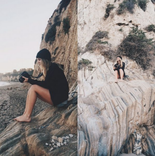
That’s only the first step, though — once you’ve picked a basic grid option, Layout lets you tweak it to make it work better with the specific photos you’ve chosen. You can grab the grid lines to adjust a photo’s size, swap photos in and out of different slots, and use mirror and flip tools to create some unusual (and goofy) collages. You can also pan around each image inside of its grid square to make sure the crop shows the most important parts of the picture. Instagram played up those mirroring features heavily in the sample images it shared with us — rather than only making grids that are clearly composed of several shots, Instagram wants to see people get creative and try more abstract designs.

Once you’ve tweaked your collage, you have to save it to your camera roll — it’s a requirement, not an option. Barnett said that was because they’ve found lots of users like to make multiple versions of different collages and compare them before posting the best one to Instagram.
If you know you nailed your layout on the first try, though, Layout presents you with one-tap options to export to Facebook and Instagram; it also uses the iOS share sheet for exporting to other apps. When exporting to Instagram, Layout transfers you right to the post-camera section off the app for selecting filters and making adjustments before posting and sharing.
Layout is a determinedly simple app — choose your pictures, choose your layout, and make a few quick adjustments. That’s all it does, and its designers are happy to admit it. Even as Instagram’s flagship app has gotten more flexible, adding more granular editing tools to the filters it first became known for, the company wants to keep advanced techniques like Hyperlapse and collages in their own apps.
That strategy made sense with the Hyperlapse app — while Instagram has built out its video features over the years, the vast majority of posts are still images. Since Layout’s features are entirely focused on still images rather than videos, it might have made sense to roll these features into the main Instagram app. But while collages are increasingly popular, plenty of users aren’t making them — and those that do are already editing and making collages in other apps before porting them into Instagram. It’s probably a smart choice to make a big splash with this new app to get those users to try a new app that can fit right into the workflow they’re already using.
source:
0 comments:
Post a Comment