
A report last week revealed that Apple’s upcoming iOS 9 and OS X releases will bring a major typeface change, with Apple apparently aiming to offer the same system font across devices, no matter how large it is. Called San Francisco, the new typeface is already used on the Apple Watch to increase readability, and a designer has now released a quick visual analysis of the font, and what makes it remarkable.
DON’T MISS: Former Android diehard ‘never looking back’ after switch to iPhone 6 – find out why
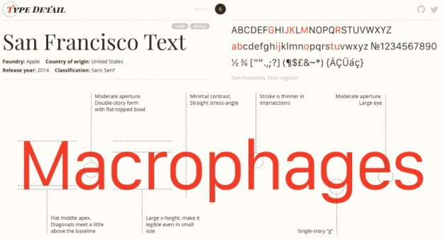
Wenting Zhang, who provides a deep dive into one font each day on his Type Detail website, has dedicated a day to the San Francisco font, explaining its features.
According to the image above, one of the advantages of the font is the “large x-height,” or the increased height of the lower-case letters compared to capital letters, which is one factor that can improve readability. Other features that should increase legibility include “larger eyes” for smaller case letters (such as “a” and “e”), thinner strokes at intersections, minimal contrast, straight stress angles and single-story “g”.
The San Francisco page shows different weights, styles and sizes for the font, and says that Apple’s chosen font for iOS 9 and OS X is similar to Open Sans and Arial.
Apple is expected to unveil iOS 9 and OS X 10.11 at WWDC in a few weeks, at which point it’ll likely share more details about its new typeface direction, assuming these reports are accurate.
A screenshot showing Zhang’s analysis of the San Francisco font follows below.
source:bgr.com
0 comments:
Post a Comment